

Why QR Codes Fail in the Real World (and How to Print Ones That Do Not)
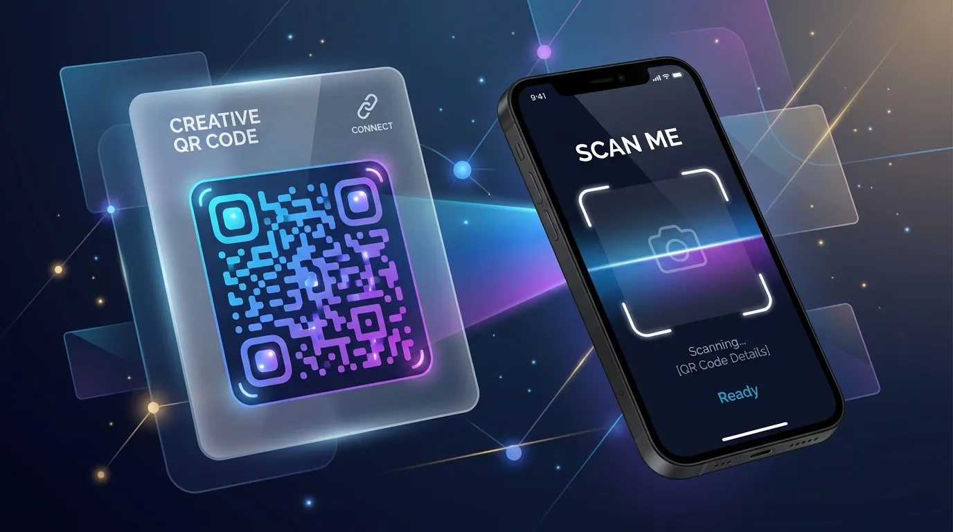
A QR code that scans instantly on your monitor can be completely dead on a printed menu. The code is not wrong — the conditions changed. Screens are backlit, perfectly flat, and pixel-precise. Print is none of those things. Here is what actually breaks in between.
It is too small for its scanning distance
The most common failure by far. A useful field rule: the code needs to be roughly one tenth of the distance it will be scanned from. Scanned at arm's length, about 30cm, it wants to be around 3cm square. On a poster read from three metres away, it needs to be about 30cm square — far larger than most designers instinctively place.
And size interacts with data length. A long tracking URL packs more modules into the same square, making each module smaller and each one harder to resolve. Shorten the destination URL before generating the code, not after you have discovered the problem.
There is no quiet zone
A QR code needs clear margin around it — about four modules' worth. Designers routinely crop it flush against a border, a photo edge, or another element because the whitespace looks like wasted space. Scanners need that margin to find the code's boundaries. Without it, many will not detect there is a code there at all.
The contrast is decorative rather than functional
Coloured codes are fine. Low-contrast codes are not. Two rules survive every brand guideline:
- The dark modules must be genuinely dark and the background genuinely light — not two mid-tones from the same palette.
- Never invert. Light modules on a dark background fails on a meaningful share of scanners, even though it looks striking.
Also: printing dark modules in a rich black built from four inks invites misregistration, which softens every module edge. Ask the printer for a single-ink black.
The surface is working against you
Glossy laminate on a menu under overhead lights produces exactly the glare that blinds a phone camera. Curved surfaces — bottles, cups, tubes — distort the module grid. Fabric and uncoated stock let ink bleed, blurring the boundary between light and dark modules. None of these are visible in the artwork file.
The logo ate too much of it
Error correction is what lets you place a logo in the centre at all. At the highest level, roughly 30% of the code can be obscured and still decode. That is a budget, not a licence: the logo, a rounded module style, and a coloured overlay all draw from the same pool. Raise the error correction level when you add a logo, and keep the overlay under about a fifth of the area.
Test like it is going to press, because it is
- Print a proof at the exact final size, on the exact final stock. Not a screen mockup.
- Scan it with at least three phones — an older Android, a current iPhone, and something in between.
- Test in the real lighting: dim restaurant, bright shop window, outdoors.
- Scan from the distance a real person will stand at, not from 10cm away.
- Use a dynamic code if you can, so a wrong destination is a settings change rather than a reprint.
Every one of these failures is cheap to catch on a proof and expensive to catch on ten thousand printed flyers.